Mantality Health

Overview
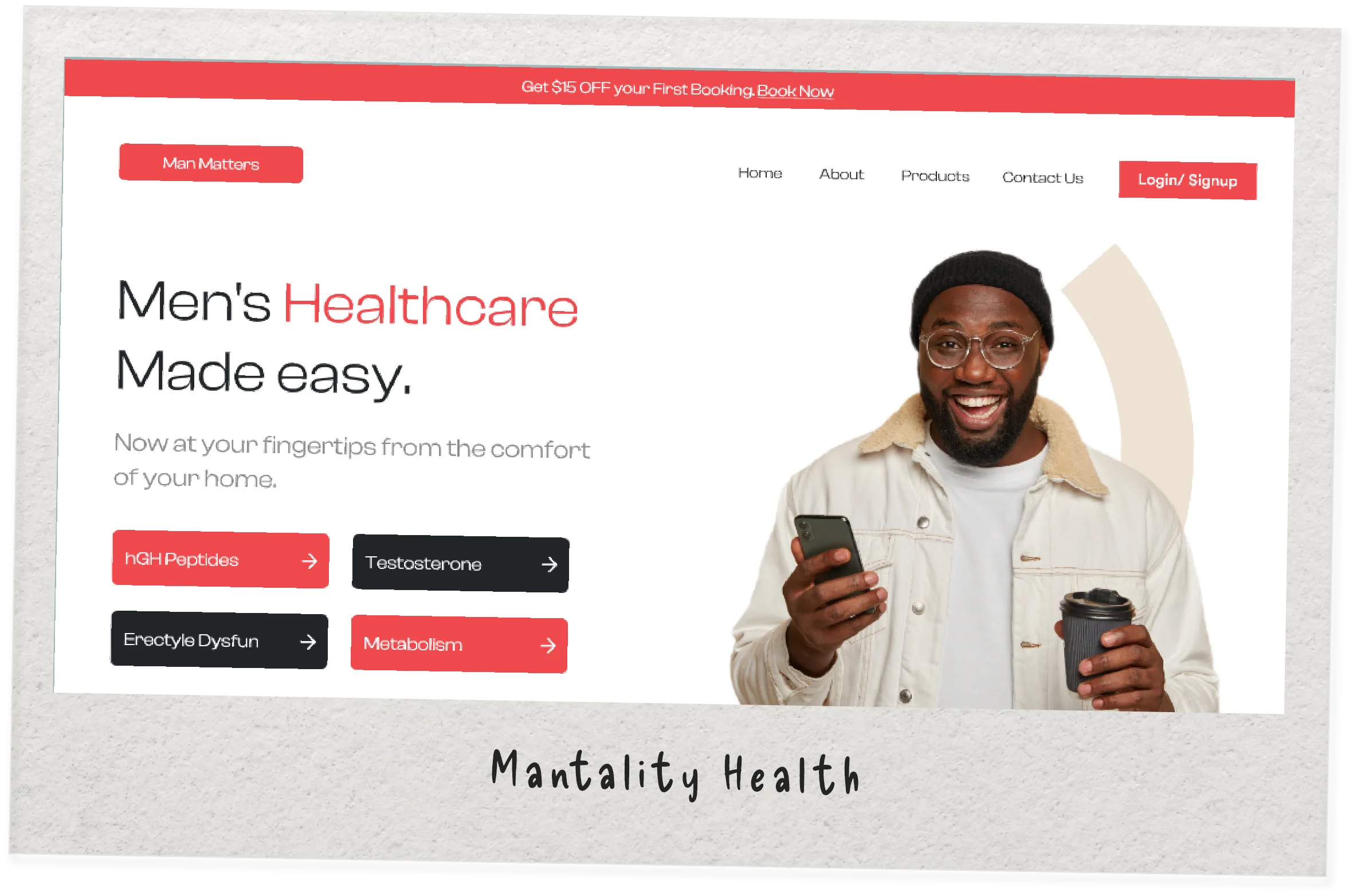
Mantality Health is a men’s health clinic based in the U.S. Their outdated website was slow, hard to manage, and not converting well. I was hired to redesign and rebuild it for speed, clarity, and performance.
🎯 Objective: Build Trust & Bring in Leads
Design a site that shows empathy, breaks the stigma, and builds trust at first scroll - without sacrificing
business goals.
At the same time, the website had to convert visitors into patients, gently guiding them to take action.
That meant:
- Communicating clearly and confidently
- Making the experience feel approachable
- Designing call-to-actions that invite, not pressure
The challenge wasn’t just to build a site. It was to build belief - in the clinic, in the process, and in self-care.
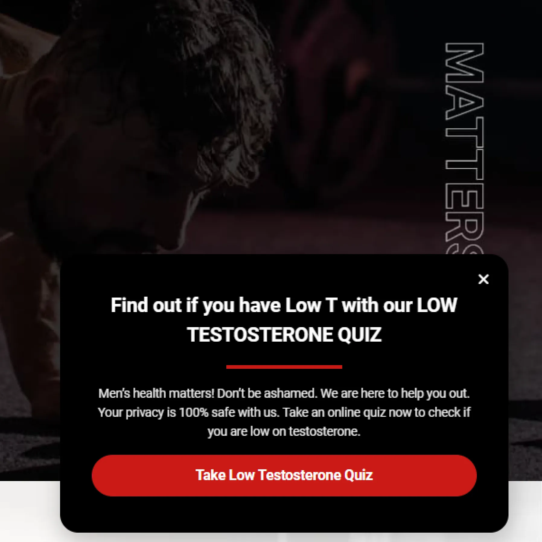
🧱 Challenges: More Leads, Less Pushy
You know what turns people away? Salesy Pop-ups, hard sells, and generic copy.
I needed to:
- Improve lead generation without sounding like a used car salesman
- Keep things visually calm, clean, and welcoming
- Help users feel like they’re in the right place even before reading a word
- The website had to say: “We’re here. We’re listening. You’re not alone.”
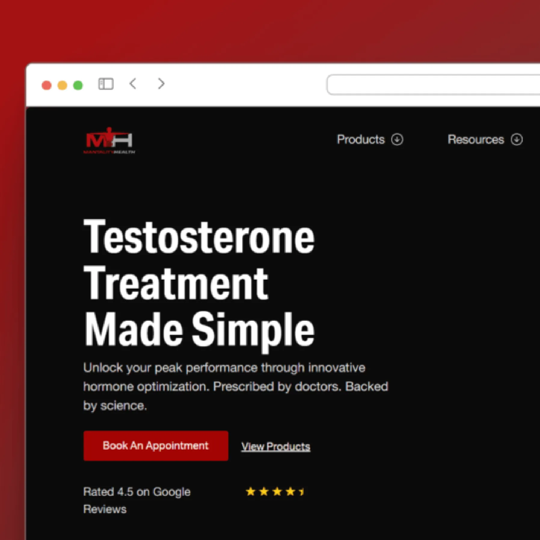
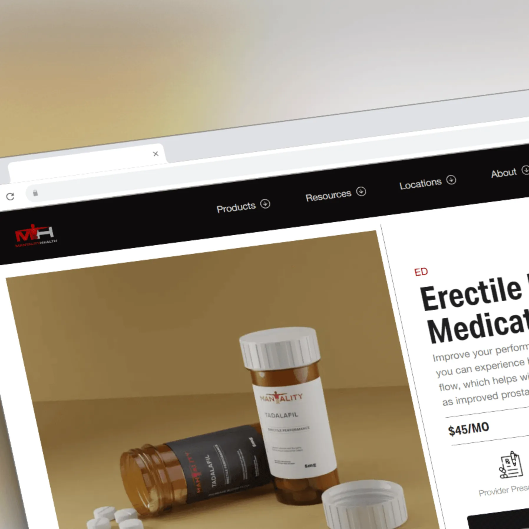
✨ A Website That Works & Welcomes
The redesigned Mantality Health website is more than a facelift, it’s a fully rethought digital
experience.
Here’s what changed:
- A modern, responsive design that feels calm & confident
- Simplified navigation, so users know exactly where to go
- Content that feels like a conversation, not a prescription
- Built from scratch with a custom theme that’s fast & easy to manage
- Smartly placed CTAs that guide users naturally without pushing
Visitors now feel safe, informed, and ready to take the next step, resulting in more qualified leads and happier clients.
What they said:
I just wrapped up a fantastic handover meeting with the Mantality Health team, and things are looking great for their web presence.
Get in Touch with me